Expandable Footer
An adhesion unit that can expand automatically, or by user interaction.
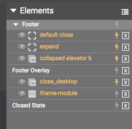
The default Expandable Footer has 3 states, that you will see indicated in the "Components" menu.
- Footer - default footer that displays at bottom of site
- Footer Overlay - expanded state
- Closed State - small corner bug floating over site

Elements Panel - 3 states of Expandable Footer
To navigate between stage states, you will use Actions tied to button clicks (or rollover).
From Footer to Expanded state.
on Click - Stage - Open Footer Overlay
From Footer to Closed State (or nothing).
on Click - Stage - Close Footer
From Footer Overlay to Default State
on Click - Stage - Close Footer Overlay
From Closed State to Footer (default)
on Click - Stage - Open Footer

Example Action - Open Footer Overlay
Updated about 1 year ago
