Module: Hotspot
Overview
The Hotspot is a very flexible module. It's a transparent module that can be used as a container to assign a series of actions. The module itself does not have any settings other than the top level properties. This is by design. Simply drag to resize the actionable area, then open the actions panel to drive the module.
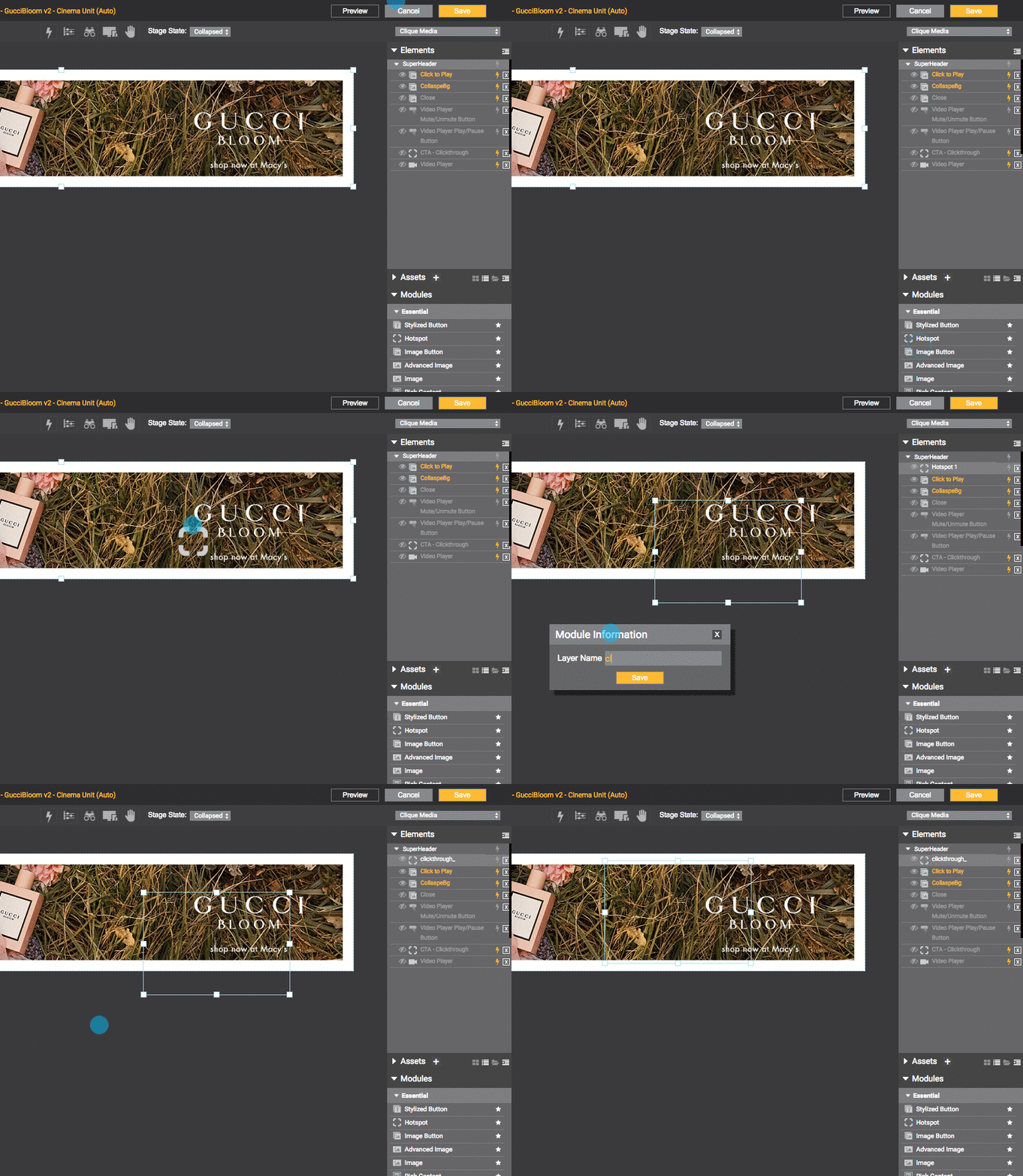
The most common use case for the hotspot is creating a clickable area but you can also use it as a trigger point. For example, "On Show" of hotspot, trigger a chain events. The GIF below shows a clickable area being created with the "On Click" trigger to animate the gray shape but setting this as an "On Show" is easily done and would trigger the same animation. For more info on actions, click here.

Adding Hot Spot button to stage.
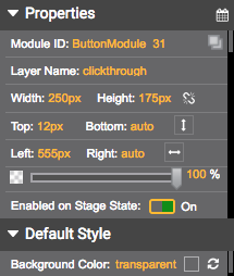
Properties: These are your top level settings.
Module ID: Identifies the system module.
Layer Name: Name of module layer.
Width, Height, Top, Bottom, Left, Right: Positioning options.
Vertical and Horizontal Icons: Auto positioning options.
Opacity Slider: Adjust the opacity of the module.
Enabled on Stage State: If enabled, module is shared across various states/stages of the ad.
Background Color: transparent (select color)

HOT SPOT BUTTON
Properties.
Updated about 1 year ago
