Module: Stylized Button
Overview
The stylized button module allows you to build a button from scratch within the workshop. We give you a number of styling options for the various states of a button. This is the module to use if your primary goal is to build a button from scratch using basic styling options.

Settings
Properties: Contain general top level settings for the module.
Module ID: Identifies the system module.
Layer Name: Name of module layer.
Width, Height, Top, Bottom, Left, Right: Positioning options.
Vertical and Horizontal Icons: Auto positioning options.
Opacity Slider: Adjust the opacity of the module.
Enabled on Stage State: If enabled, module is shared across various states/stages of the ad.
Button Text: Copy that appears on the button.
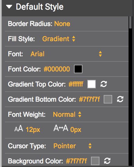
Default Style: In this section, we give you control over default properties such as the font, font weight and border radius in addition to traditional styling options.

States: A button can have various states. Settings are offered for each state for total control over the ad experience.
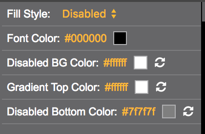
Disabled Style: Styling when the button is in a disabled state.
Hover Style: Styling for the hover state of a button.
Selected Style: Styling for a selected state.

If you have any questions or concerns, please reach out to your account manager.
Updated 12 months ago
